

In the following article, we shed light on Shopware 6 Shopping Experiences. Below, we discuss what Shopware Shopping Experiences are and how to configure them. Also, you can find more articles dedicated to Shopware 6 here: Getting Started With The Platform.

Note that we provide Shopware integration with external platforms. Contact our support for further information or try our Improved Import & Export Extension for Shopware. We can even import CMS pages to Shopware 6.
Table of contents
The Shopware 6 Shopping Experiences Definition
Shopware 6 Shopping Experiences represent a separate type of content that delivers an additional layer of personalization. The feature empowers you to create content pages that are more customer-centric. The system lets you generate layouts that consist of sections split between individual blocks, which in turn are represented by one or more elements. Text or images are considered the smallest partitions of Shopping experiences.
However, creating layouts that consist of text, images, and other content is only a basic functionality associated with Shopware 6 Shopping Experiences. Further functions for the Shopping Experience are provided by the CMS extension. Note that this feature is available in the Shopware Professional Edition onwards. We describe it in another article: Shopware 6 CMS Extension.
Where to find shopping experiences in Shopware 6
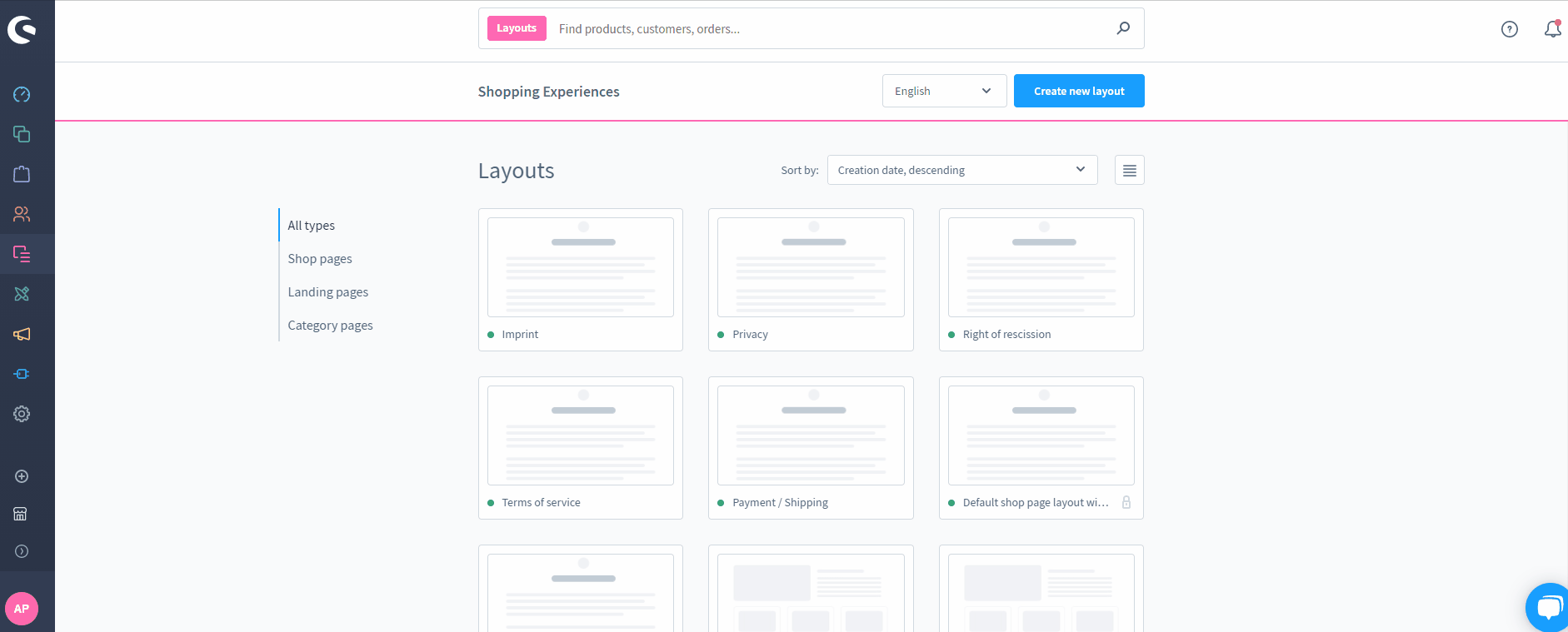
Now, when you know that Shopping Experiences in Shopware 6 are associated with basic frontend layouts, it is necessary to find them in the admin. The Shopping Experiences section is situated in the Shopware 6 administration under the Content section.
When you open the Shopping Experiences page, you can find an overview of all layouts already created. There is also a search box that helps you find the created layouts. Besides, you can use flexible sorting options to order the display of Shopware 6 layouts. The system lets you sort the list by the creation or editing date.
At the same time, there is a menu called Layouts on the left side of the page. It enables you to filter the layouts thematically. Also, it is possible to limit the display to all shop or landing pages here.
Each entry is also equipped with a context menu. It lets you delete or preview the respective layout. The preview screen makes it easier to distinguish the layouts.
You can also edit any layout on the Shopware 6 Shopping Experiences screen. Click on the corresponding entry to modify it.
Also, the system lets you create new layouts.
How to Create a Layout in Shopware 6 Shopping Experiences
To create a new layout in Shopware 6 Shopping Experiences, follow these steps:
- Open the Shopping Experiences page in your administration.
- Hit the Create New Layout button.
- Follow a step-by-step query described below.
Layout Type
At this stage, you need to specify the page type for which you create a layout. Thus, you will not only better sort your layouts in the overview but also simplify further editing by choosing between different blocks depending on the selected type.
Shopware 6 lets you create shop pages, landing pages, listing pages, and product pages as a part of Shopware Experiences. Let’s define each type.
Under shop pages, we assume all service pages of your shop, including general terms and conditions, shipping conditions, or contacts.
Landing pages, in their turn, offer a wide range of design and marketing options and are associated with various marketing efforts. Here, your customers land during their visit to your e-commerce website.
Category pages include a product listing. With Shopware 6 Shopping Experiences, you get the ability to display texts dynamically here.
Product pages are spots where all the information about a product is displayed. Some blocks are available as standard. For instance, product descriptions and image galleries are always at your service. However, Shopware 6 delivers an opportunity to customize the way your product pages look.
Section
Once you have decided on a layout type, choose its structure. Shopware 6 offers various ways to structure your pages. For instance, you can use a layout with a sidebar or create a plain page. Use the former to display the category navigation, filters, or both.
Note that at later stages, you can add further sections even if they differ from the initial layout type.

Name
Now, when the layout structure is specified, you need to name your new layout.

Congratulations! You’ve finished the basic layout configuration routine associated with Shopware 6 Shopping Experiences. However, the most interesting part starts next when the layout editor opens.
Shopware 6 Layout Editor
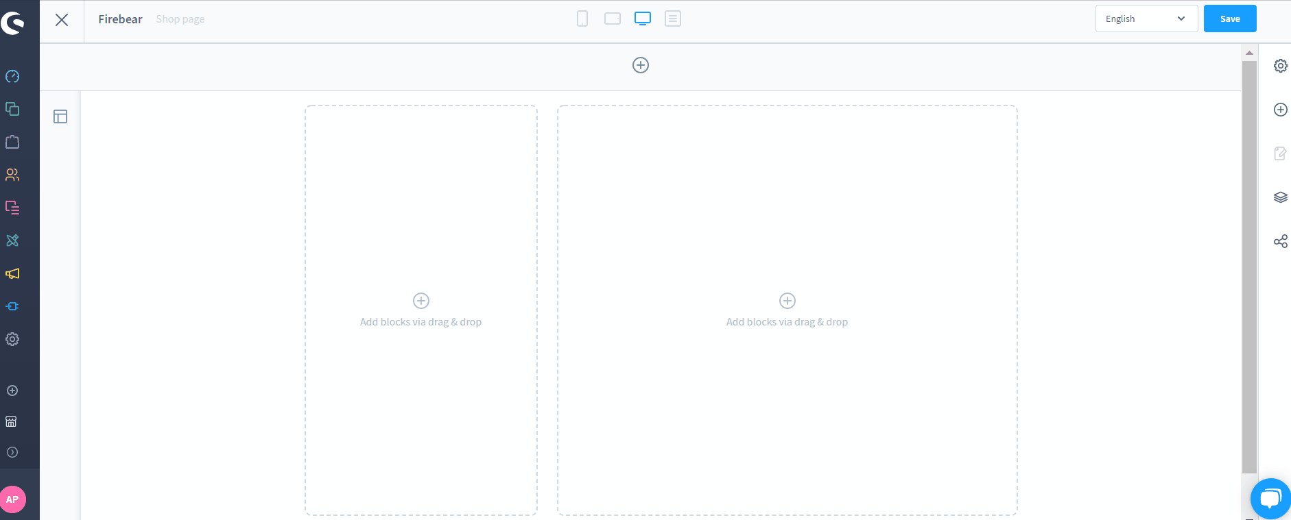
You can use the Shopware 6 layout editor to continue editing your newly created layout or modifying an existing one. Its main screen looks as follows:

You can see the central editing area which depends on your layout type and structure. However, the menu bar is always situated on the right side. Here, you can activate the individual editing functions, divided into the following areas:
- Settings;
- Blocks;
- Navigator;
- Assignment.
By clicking on a certain block or the whole section, you can reach the Block settings or the Section settings correspondingly.
Hit the “+” (plus) button at the top to add a new section. Hit the “+” (plus) buttons in the blocks to add content to blocks.
Also, note that the icons on the top bar let you switch between different viewports. Thus, you can effortlessly preview how the layout is displayed on different screens.
Settings
In the Settings section, Shopware 6 lets you change the layout name and type.

Blocks
As for the Blocks menu item, it lets you choose from various predefined blocks, grouped by categories. You can select them from a drop-down menu. Note that each block consists of one or more elements. You can individually fill each of them with content.

How to add blocks to Shopware 6 layouts
Shopware 6 offers drag-and-drop functionality to help you place blocks in the desired position.
How to add content to Shopware layout blocks
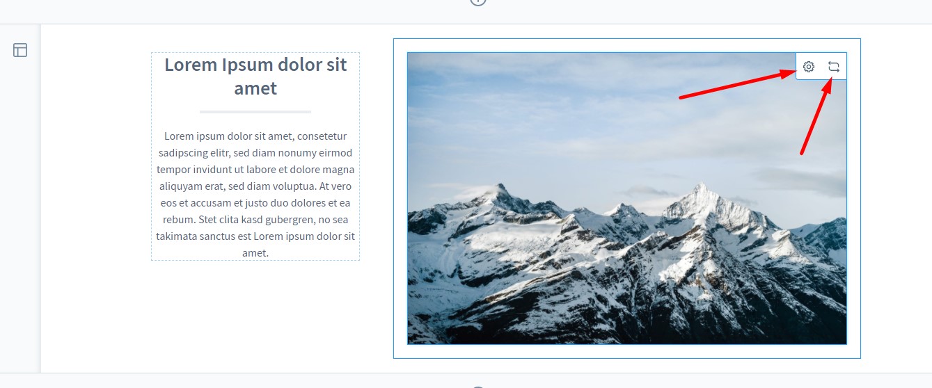
Now, let’s see how to adjust the content of an element within a Shopware block:
- Hover over the element in the preview.
- 2 symbols in the upper right corner of the element display:
- The gear symbol opens a new window to add content to the element;
- The 2 arrows symbol lets you change the element. Use it to replace a text element with an image, etc.

There are different settings depending on the block you want to edit
Text
Text blocks contain a text editor. You can add texts in different formats.

For Category Page as layout type, Shopware 6 displays the data mapping on the right side above the editor. It lets you select dynamic category texts, which are displayed within the element.
Also, the system allows you to use variables. It means that you can integrate category or product information directly into the text. Next, the system will change the displayed data depending on a product or category.

It is also worth mentioning that Shopware 6 enables formatting for variables. You can use the basic functionality of the text editor. However, you need to apply the formatting to the complete variable including the curly brackets. If you don’t do that, the variable will no longer be displayed correctly.
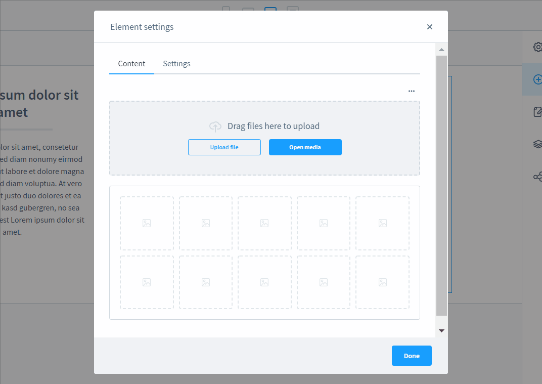
Picture
Picture blocks let you add pictures to the layout. Although they contain only images, Shopware 6 delivers several different formats of such blocks.

You can upload a new image. Note that the content of the image can be filled automatically with the item Data assignment. For instance, a product page can show the product preview image or the manufacturer preview image.
Specify the display mode. Note that the Standard option lets the image adapt to the surrounding box following its native size. The Fill option fills the box with the image completely. The Stretch option stretches the image to the size of the box.
Choose the vertical alignment. The image can be placed at the top, center, or bottom.
Specify a URL to which the image should link. Shopware lets you open the new destination either in the same tab or in a new one.
Although Shopware doesn’t apply limits to the image element, you should make sure that the image is not too large. Big images reduce the performance. Also, the system sets the image width in the standard template to a maximum of 1320 pixels. Pictures are dynamically scaled down at smaller resolutions.
Slider
The image section also lets you add sliders. You can configure this content element as follows:
Choose the display mode:
- Standard – the image is displayed completely (all images in the slider should have the same aspect ratio);
- Cover – the image fills the element completely (note that smaller images are stretched, images with an unsuitable aspect ratio are cut off);
- Contain – the highest deposited image determines the height of the element (not adjusted between different images).
Specify the image minimum height if you’ve previously chosen the Fill display mode.
Choose the image vertical align if you’ve previously chosen the Contain display mode. You will specify how the images are to be placed within the slider. It is also worth mentioning that free spaces display for smaller images.
Add arrow navigation to click through the images. The arrows can be displayed on the displayed image, next to it, or hidden.
Alternatively, you can enable dots navigation: a small dot will represent each deposited image.
Next, you can specify a link for each image that you have uploaded to the slider.
Gallery
Besides, the image section lets you add galleries that are similar to sliders. You can configure this content element as follows:

Choose the display mode:
- Standard – the image is displayed completely (all images in the slider should have the same aspect ratio);
- Cover – the image fills the element completely (note that smaller images are stretched, images with an unsuitable aspect ratio are cut off);
- Contain – the highest deposited image determines the height of the element (not adjusted between different images).
Specify the image minimum height if you’ve previously chosen the Fill display mode.
Choose the image vertical align if you’ve previously chosen the Contain display mode. You will specify how the images are to be placed within the slider. It is also worth mentioning that free spaces display for smaller images.
Add arrow navigation to click through the images. The arrows can be displayed on the displayed image, next to it, or hidden.
Alternatively, you can enable dots navigation: a small dot will represent each deposited image.
Also, you can enable the preview navigation when the small images for the gallery preview are displayed to the left of the image or below it.
The Zoom option lets visitors display an enlarged representation of the image if they hover over it.
And you can enable the fullscreen gallery, allowing the gallery to be displayed on a full screen.
Commerce
Commerce is another type of shopping experience block. Such blocks contain various product-specific elements and data. As a result, you can leverage them in promotions or offer products on your storefront in a more user-friendly way. Let’s describe the core elements of Shopware commerce blocks.
Product name & manufacturer logo
The product name & manufacturer logo block combines two types of blocks: a text block and an image block. Let’s assume that the shopping experience is a product page. In this case, Shopware 6 fills in the text box with the respective product name. As for the image block, it is connected with the manufacturer’s logo.
Three product boxes
The system lets you add three product boxes to the commerce block. For each of them, you can specify a particular product that will be displayed here.

Next, you select a layout type, specifying how the product should be represented in the block: in the default view, with a large image, with minimal text, etc.
In the display mode field, specify how the images display. The following options are at your service:
- Standard – the image is displayed completely (all images in the slider should have the same aspect ratio);
- Cover – the image fills the element completely (note that smaller images are stretched, images with an unsuitable aspect ratio are cut off);
- Contain – the highest deposited image determines the height of the element (not adjusted between different images).
You can fill in the Vertical align field only if you choose the Contain display mode. It is responsible for placing the images within the slider element. Note that smaller images are enhanced with corresponding free spaces.
Product slider
Enter the title of the slider and add products to it under the Content tab. Note that its title is also displayed on the storefront.

As for the Settings tab, it lets you choose a display mode. Shopware 6 Shopping Experiences are usually associated with the following three modes:
- Standard – the image is displayed completely (all images in the slider should have the same aspect ratio);
- Cover – the image fills the element completely (note that smaller images are stretched, images with an unsuitable aspect ratio are cut off);
- Contain – the highest deposited image determines the height of the element (not adjusted between different images).
Now, you can specify a vertical alignment for the Contain display mode. This parameter specifies how the images are to be placed within the slider element.
Choose the layout type: the default view, a large image, or minimal text.
Enable the navigation arrows on the sides and turn on automatic sliding (images switch between one another every 5 seconds).
You can also draw a frame around the slider, separating it from the area beyond.
It is also possible to set the minimum width of an individual product box.
Gallery and Buybox
As for the gallery and buybox blocks, they incorporate the following elements:
- a Gallery picture block,
- a Buybox.
While the former lets you display images, the latter provides the ability to specify the product to which the Buybox is linked. Besides, you can configure its exact position in relation to the Gallery block.
Furthermore, if you deal with a product page, Shopware 6 links the gallery and the buybox to the respective assigned product automatically.
Product description and review
Here, you assign a product to display its description and reviews. If you deal with a product page, Shopware links the block to the assigned product automatically.
Cross-Selling
The Content tab here lets you specify the cross-selling products. Next, proceed to the Options tab. It allows you to set the layout type: the default view, a large image, or minimal text.

After that, you choose one of the following display modes:
- Standard – the image is displayed completely (all images in the slider should have the same aspect ratio);
- Cover – the image fills the element completely (note that smaller images are stretched, images with an unsuitable aspect ratio are cut off);
- Contain – the highest deposited image determines the height of the element (not adjusted between different images).
Now, set the minimum width of an individual product box.
Video
Shopware 6 Shopping Experiences support two types of videos: YouTube and Vimeo. Depending on the platform, you have two different configuration screens.
YouTube

Follow these steps to add a YouTube video to Shopware 6 Shopping Experiences:
- Place a video URL;
- Enable/disable automated playback;
- Enable/disable video loop;
- Show/hide video controls;
- Activate the advanced privacy mode to prevent saving any information from visitors until they watch the video;
- Choose a part of the video that should be displayed;
- Select the display mode.
Vimeo

Follow these steps to add a Vimeo video to Shopware 6 Shopping Experiences:
- Place a video URL;
- Enable/disable automated playback;
- Enable/disable video loop;
- Show/hide video controls;
- Choose what color you want the navigation to appear in;
- Specify whether to display information about a video creator or not;
- Show/hide video title.
If you decide to add a sidebar, we have some good news! No separate settings are required since Shopware 6 fills in this block automatically.
Form
On the Content tab, select the form type, enter its title, and add a confirmation text.
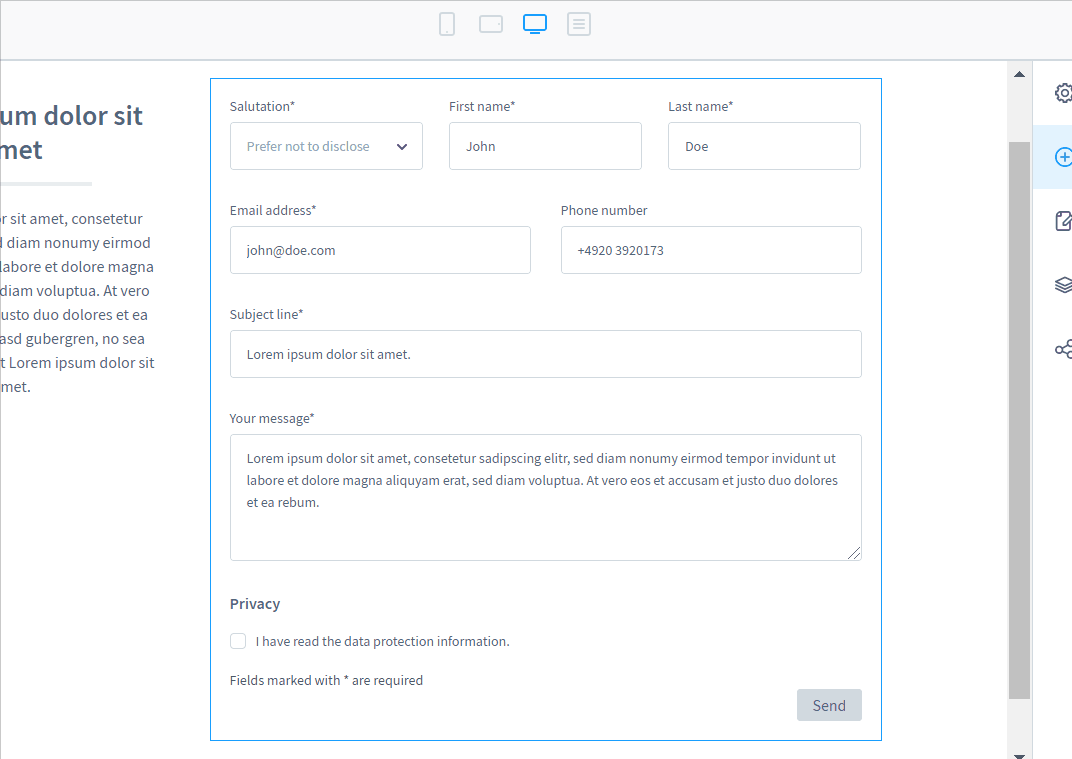
On the Settings tab, specify a recipient who will receive the filled-in form.
Product listing
Select the Category Page layout type when creating a layout and it will automatically include a Product Listing Block. Consequently, the system will display the products of the respective category.
The corresponding settings section lets you choose standard, large, or minimal content display types.
As for the Sorting tab, it lets you set how the products from the product listing should be sorted.

It is possible to enable the selection of sort orders for this product listing or use custom sorting.
You can also set the default sorting if custom sorting is enabled. Sortings are available under Settings -> Shop -> Products.
Also, choose all the assortments that should be available on the frontend in the product listing as a drop-down menu. You can change the priority or use the drop-down menu on the right to eliminate the selected sorting options from the list.
The product listing block also contains the Filter tab. Here, you can determine filters for the frontend display.

Firstly, the tab contains the area with the general filters, including manufacturer, rating, and price.
Secondly, you can configure filters based on product properties. They are active by default. You can turn off any filter. It is also worth mentioning that a filter displays only if at least one product with this property is available in the category.
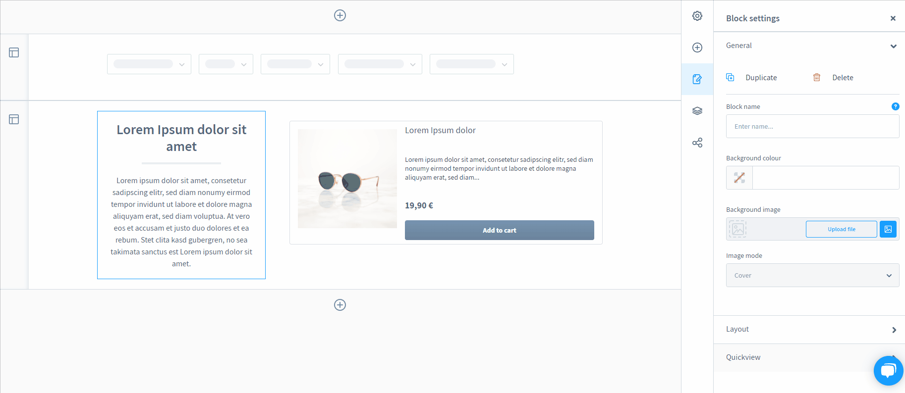
Block Settings
You can open block settings as follows:
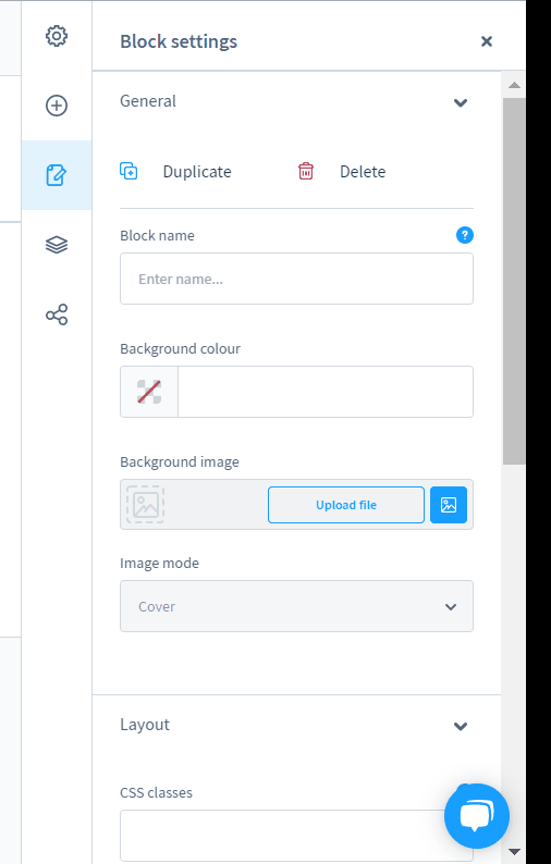
- Go to the preview;
- Click on a block you want to edit;
- Click on the block settings icon (you can see it below the plus icon).
- The basic settings for the currently selected block display.
Now, you can specify a block name, background color, background image and its position in the block, and other layout settings, including the distance between the block elements.
Section settings
You can open section settings as follows:
- Go to the preview;
- Click on a section icon you want to edit;
- Click on the section settings icon (you can see it below the plus icon).
- The basic settings for the currently selected section display.
You can specify a section name, add one or more CSS classes, choose a sizing mode, hide the content from the mobile view (sw-cms.sidebar.mobile), specify a background color or background image and its mode, etc.
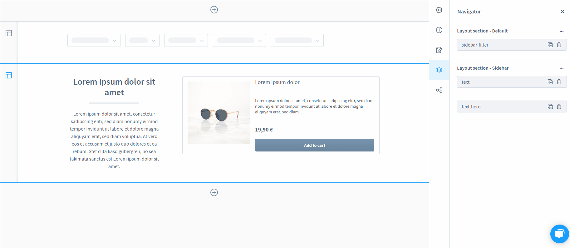
In the navigator, you can view all blocks sorted by names. You can change their order with the help of the drag-and-drop functionality.

Also, use the plus symbol to create a copy of the block. The trash symbol removes the block.
How to Assign Shopping Experience To A Page In Shopware 6
Shopware 6 delivers numerous ways of assigning shopping experiences to the storefront pages. Let’s explore the most common approaches.
Layout-Editor
Shopware 6 lets you use a layout editor to assign shopping experiences to storefront pages. Choose the Layout assignment button in the menu on the right side.
Next, click on the Assign layout button. The system will open the assignment window.
Here, you should click on the Choose categories area. Choose records from the list. After that, hit the Assign layout button.
If you switch between layouts, the confirmation window displays.
Shop pages
If you want to assign layouts to shop pages, such as terms and conditions or imprint, you need to go to Settings -> Shop -> Basic information. Assign shopping experience layouts here.

Categories
You can also assign layouts while editing category pages. The corresponding section is displayed below:

Product page
Shopware 6 lets you assign product page layouts created in the shopping experience to products as follows:
- Go to your admin;
- Open a product you want to edit;
- Proceed to the Layout tab;
- Select a layout you want to assign to a product page.

How to Import Shopping Experiences (Layouts) to Shopware 6
Our team lets you simplify and automate various routine processes associated with managing your Shopware 6 backend by importing the existing data. Contact our support for more details and try our Improved Import & Export Extension for Shopware. You can use it to import any entities to Shopware 6. Please, consult our specialists before using the module for transferring layouts to Shopware 6.


