So you want to make your ecommerce store the best it can be, minimize cart abandonment and deliver a great experience for your target audience?
Excellent, you’ve come to the right place.
As an ecommerce store owner, you already know that anyone can open a shop and sell to potential customers all over the world. You also know that it’s not as easy as it sounds — and there’s a lot to get right.
Common Ecommerce Mistakes
There’s a difference between having “an online store” and having “an online store that gives users an awesome experience.” Any business owner should be focused on the latter, and we’re going to help you achieve it.
First, let’s quickly consider why it’s important to avoid the mistakes. People are spoiled for choice of where to spend their money, and if retailers make it too complicated or frustrating to use their shop, customers simply go elsewhere. If they make a purchase, they’re unlikely to return if it was an unpleasant experience. Maybe they’ll even leave a poor review, persuading other potential customers to avoid your ecommerce store.
All of which highlights the importance of reducing friction in the shopping experience, from compelling product images to intuitive website design.
We’ve categorized the following 18 ecommerce mistakes into four sections:
- Not Understanding Your Product or Audience.
- Improper Tech Stack.
- Issues with the product pages.
- Failure to provide a great user experience.
Ready? Let’s jump in.
Ecommerce Mistake #1: Not Understanding Your Product or Audience
“If you build it, they will come” is bad advice for business owners.
It’s the exact opposite of best practice.
If you don’t understand your product or audience, you’re guessing that they want your product. If they don’t, they won’t buy it. And if they won’t buy it, you’ve lost time and money by creating an online store.
What you need to do is identify the need in the market. By learning what your audience wants and the frustrations they have with the existing options, you can offer things they truly want. Then, you’ll have lots of potential customers all rushing to your shopping cart.
1. Not doing market research.
As Ramit Sethi, best-selling personal finance author and creator of numerous business courses, says: visit the fishing holes.
Fishermen don’t cast a line in the first pool of water they find and just hope that fish will come to them. Instead, they do some research, go to where the fish already are and offer something they can’t refuse.
In a market research sense, these fishing holes are all around us: Google searches, Facebook groups, YouTube videos (and comments), reviews for your competitors, forums—the list is endless. Each of these fishing holes gives you a treasure trove of information, from product information to customer service expectations, and these holes are excellent places for you to test the waters of your ecommerce business.
Regularly spend some time listening to this feedback, and use it to target customers. Your conversion rates may never look the same again.
2. Failing to define your target audience.
Imagine trying to sell a staircase to someone who lives in a single-story home. It doesn’t matter how good your staircase is, how compelling the price is, or how eloquently you explain its benefits; that person will never buy it. Worse, they’re probably getting irritated hearing from you and may tell their friends and family to ignore you.
If this sounds far-fetched, consider this: “56% of consumers believe businesses need to have a deeper understanding of their needs … [and] 51% of consumers believe brands send too much irrelevant content.”
As a starting point, think about what problems you solve for your target customers. As you gather more information, you can create full buyer personas, which can even be used to reach more people who are likely to buy from you. That information would include:
- Demographic information (age, gender, marital status, income etc.).
- How they make purchasing decisions.
- Interests and hobbies.
- Preferred platforms.


Source
If you need an example of how this looks in practice, Bliss is doing it right. With this messaging, it’s clear the company is appealing to health-conscious consumers who don’t want just any skin products; they want products that contain only healthy and natural ingredients.
3. Pricing products with no research.
When you’ve collected research on who your target audience is, what they want and how much of a problem you’re solving for them, you’ll also have an idea of how much your product is worth to them.
But one of the most common ecommerce mistakes is to avoid research on pricing. This is a big problem — what if your manufacturing costs are higher than the market is willing to pay? Conversely, what if your potential customers would actually pay a lot more than you think?
Many business owners will set their pricing based on how much competitors charge. There’s logic to this, but if your research shows people are unsatisfied with the available options, and you’re selling a needed solution, they may pay a premium. You can target customers who are willing to pay the extra for convenience, ethical or healthier ingredients, or an additional value of your products.


The messaging used on the Di Bruno Bros website screams premium, value and heritage.
Ecommerce Mistake #2: Improper Tech Stack
The low barrier to entry for starting an ecommerce store is a double-edged sword. On one side, you can start today with incredibly low costs — great! On the other, not all tech is equal. From user experience to security to customer retention, choosing the right platforms (or “tech stack”) for your online business is crucial.
And by choosing wisely from the start, you can save significant time and frustration later when other business owners have to migrate to different platforms.
1. Choosing the wrong ecommerce platform.
There are significant differences between ecommerce platforms. Some offer only the most basic features and not always with an option to upgrade.
Others may seem appealing at first but then surprise you with hidden costs, making it more expensive than choosing a platform with an upfront fee. Basic ecommerce platforms are less likely to have native customization options, either being reliant on third-party solutions or not having access to such features at all.
The right ecommerce platform will grow with your business, with features you’ll need as you scale or expand. For example, you may focus on B2C today but incorporate B2B in a few years.
If you’re just starting out, spend some time researching the best ecommerce platform first. Talk to other store owners, browse online communities for feedback, and then make a decision. If you’ve already opened an online store, and it’s not on a platform you can stay with as your business grows, you’ll need to consider migrating to a more appropriate one.
2. Not investing in security.
While every new business owner needs to watch their outgoings, especially early on, security should be seen as an investment rather than a cost. Fraudsters have an endless amount of ways to attack, including financial fraud, phishing scams and infected links.
It’s a matter of “when, not if” your online store gets targeted in some form, and not having the right security in place can be devastating.
There are a number of ways to boost the security of your ecommerce site. At a minimum you should have SSL certificates to protect payments, antivirus software to keep payment information safe, and switch to HTTPS to protect your users and their data. HTTPS appears as a padlock in your browser, as shown on Skullcandy’s website:


Source
3. Creating your own ecommerce CMS.
Creating your own content management system (CMS) to your own requirements can seem appealing. In reality, you’re opening yourself up to eternal frustrations and problems, including:
- Difficulty in creating it.
- Lack of support or integration with other software.
- You may underestimate the amount of features you need.
- Security becomes a lot harder.
- You’ll need to provide training.
If you want to build your own CMS for your ecommerce platform, our advice is simple: don’t! If you already have, your next step will depend on how it’s working out for you and what the future looks like. If it’s causing issues with no end in sight, you may want to cut your losses and move to an existing CMS.
Ecommerce Mistake #3: Issues With Product Pages
Product pages are perhaps the most important aspect of your site. If the product page lacks information or fails to show the item in a clear, compelling way, your potential customers are far less likely to buy it. Here are four mistakes to avoid to ensure your pages are working their hardest for you.
1. Not using social proof.
Social proof tells potential customers that buyers like your products and they’re worth purchasing. In fact, 76% of consumers admit they’re less likely to purchase from a retailer that doesn’t have reviews..
Burrow uses social proof excellently—this item has 699 customer reviews and still has five stars, which tells any site visitor that this company is the real deal.


Source
To collect more customer reviews, make it easy for your buyers. You can send an email in your automated sequence asking for a review, include a note with the item itself, or even send people to a thank-you page that asks for a review once they’ve completed the checkout process.
2. Product photos that don’t showcase the product.
Your photos are an opportunity to make your products seem desirable, even irresistible. The best item can be made to look unappealing with the wrong photography while professional imagery can make your products really shine.
Burrow’s product imagery is a masterclass, showing how the loveseat looks in a home, how it can fit more than one person, and the additional photos give a great understanding of how it looks. They even include the dimensions for potential customers to envision the seat in their house.


Skullcandy has also mastered the product image. The background matches the color of the headphones while remaining minimalist and clean, and the feature list is prominently displayed too.


Reverly takes a different approach by using relevant backgrounds to enhance the product, while maintaining a clean aesthetic.


There is more than one way to take a beautiful and compelling product image, but the golden rule is to clearly showcase the product and have a background that complements rather than detracts from the product.
3. Lack-luster product descriptions.
Product images can’t do all the work; they need to be paired with compelling, persuasive descriptions. What is so good about this product? How is it different to similar items from competitors? Why should someone buy it?
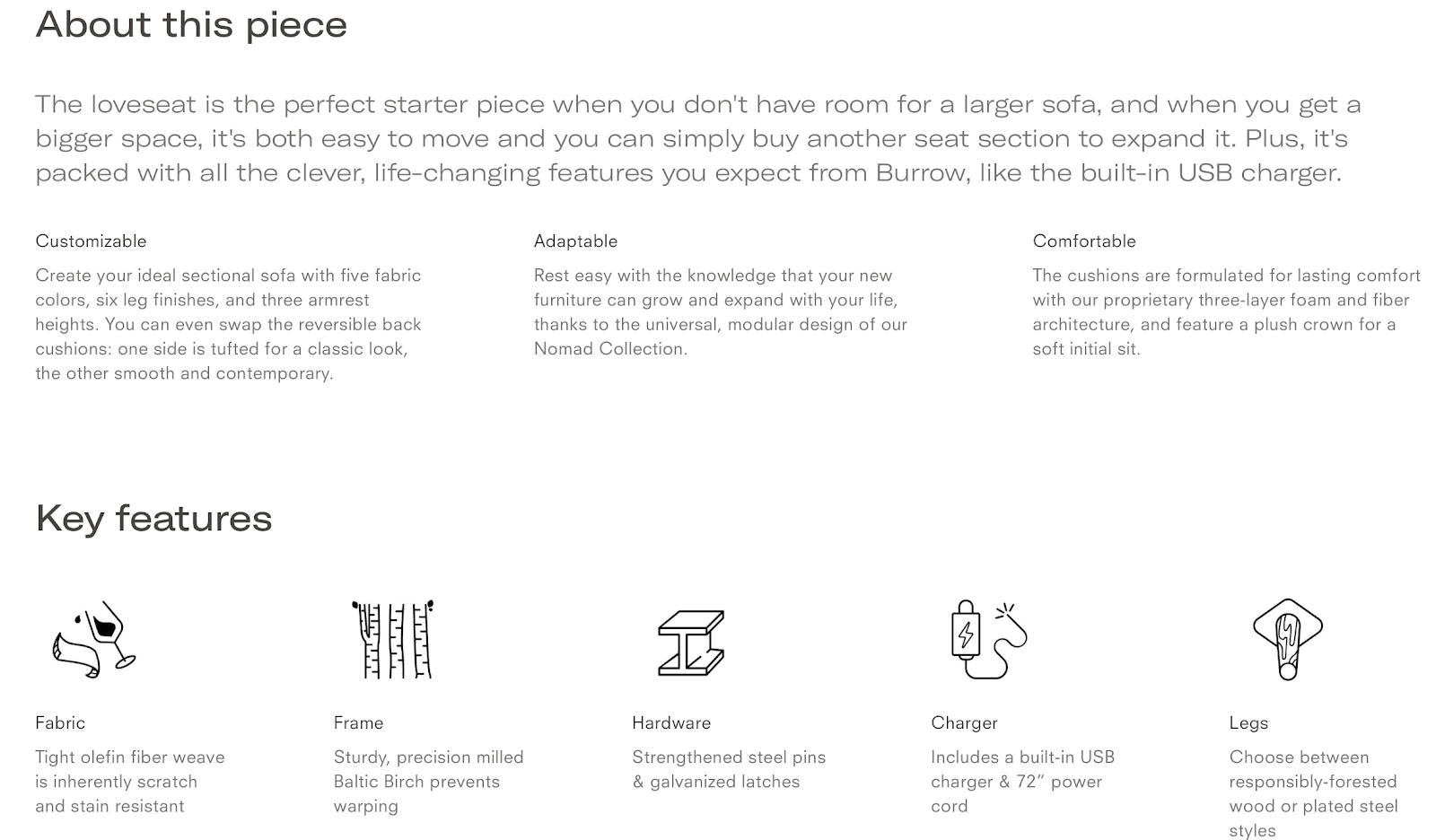
Let’s look at Burrow again. The product description is clear, concise, and broken into readable chunks that quickly explain the key features and who it’s for, with a clever use of icons to keep it visually appealing.

Source
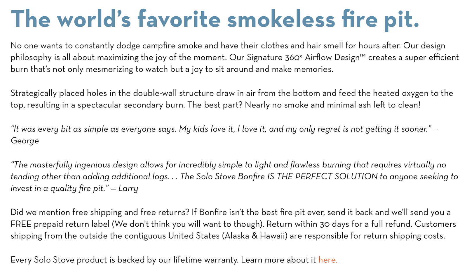
Solo Stove’s bold headline gives two key pieces of information: it’s smokeless and popular. The description then explains that the product overcomes a problem of fire — smoke and smell. We’re also told how it works, that it’s simple to use, and see expertly-placed social proof:

To perfect your own product descriptions, think about why your site visitors should buy the item and what benefit it provides. Then, share that information as clearly and succinctly as possible.
4. Poor mix of media, videos and imagery.
Your ecommerce website’s primary goal is to encourage potential customers to buy. This requires giving enough information to make the items appealing, without being overwhelming.
A common mistake is to throw everything and the kitchen sink on the site or product pages. A mix of media, including imagery and videos, can be very persuasive. But overdoing it can push people away.
If the site takes too long to load, is slow to navigate, or the visitor feels confused and overwhelmed, your site is working against you.
Every decision you make when building your ecommerce site should be focused on providing the best user experience. Which leads us nicely to mistake #4:
Ecommerce Mistake #4: Failing to Provide a Great User Experience
User experience is everything. Your website design impacts conversion rates as well as your search engine ranking, so it’s important that you get it right. Here, we’ll explore some of the most common mistakes online stores make, and how to make sure you avoid them.
1. There are no categories.
Your potential customers need to be able to find the products they want. Categories tell your visitors where to go. They can also encourage visitors to look at items they weren’t already looking for, helping to increase your sales and revenue. If they have to search or scroll through unrelated items, they’ll bounce from your site.
For an example of doing it right, see Natori. Clean and concise, users select the main menu item to then see a sub-menu to help them pinpoint exactly what they’re looking for.


The main Natori menu:


Selecting a menu item opens a sub-menu, complete with an image:


Each sub-menu has its own navigation and image related to the products. This is a nice touch to help visitors find what they’re looking for.
2. Providing little service info or business contact information.
Buying decisions are influenced by more than just the product. Consumers also want to know about shipping rates, how long delivery takes, what the return options are, and how to get in touch with questions or concerns. Not having these details causes friction for the potential customer.
Let’s take another look at Solo Stove. Within the product description is an explanation that they offer free shipping, free returns with a prepaid return label, a full refund within 30 days, the requirement for overseas customers, and a link to the lifetime warranty details. Phew! All that tells customers that Solo Stove cares about them, which makes the buying decision a lot easier.


3. Poor navigation.
As we’ve explained when talking about design and categories, good navigation is crucial. Your site has great products, contact information, details on shipping and returns — but can visitors find them?
For an example of great navigation, we go back to Solo Stove. Notice how the menu bar has everything visitors are likely to need: clear product categories, including corporate sales, as well as links to the contact page and shopping cart.


For potential customers needing more, the footer has links to the About Us page, FAQs, contact information and additional ways to connect.
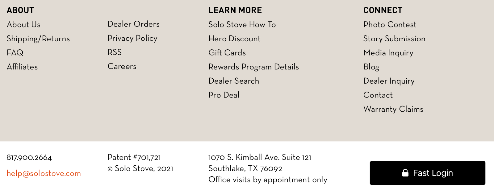

Solo Stove has removed a lot of potential friction points and doubt about the legitimacy of the store with this clear and easy navigation.
4. No guest checkout.
How many times have you added items to a cart, then abandoned because you had to make an account? If the answer is more than “zero” you already know why not having a guest checkout option in your checkout process is a mistake.
There’s an obvious reason for why ecommerce stores do this — making an account increases the amount of customer information collected and the number of email subscribers — giving the business owners an opportunity to email customers with future offers.
But the average abandonment rate is staggeringly high, Baymard calculated the average cart abandonment rate (based on 44 reported statistics) to be almost 70%. It should be a priority to make the checkout process simple and smooth so that you keep your cart abandonment as low as possible.
If you’re absolutely going to force an account to purchase, at very minimum, make it easy for your customers — use social or Gmail one-click account creation.
5. Content that is like your competitors.
Here’s a simple fact: if you don’t give potential customers a reason to buy from you, they won’t. If you sound like your competitors, what would compel people to buy from you instead of them? It’s fine to gather inspiration from your competitors, but you also need to be able to differentiate and fill the gaps that your competition leaves in the market.
The good news is this is a really easy mistake to fix. With your market research in the fishing holes and a defined audience, you should have no problem creating content that’s fresh and unique to you — giving your target audience incentive to choose you over other ecommerce stores.
6. Not using analytics to improve marketing tactics.
Effective marketing blends creativity and data. Your ecommerce store’s marketing strategy should be influenced by customer behavior.
Consider this: emails that are personalized and sent based on consumer behavior generate 29% of all email purchases and have conversion rates 359% higher than non-personalized email campaigns — all while accounting for less than 2% of total email sends.
Using analytics to improve your marketing tactics can give your online store a huge boost over competitors. It’s also quite easy to do because most platforms will provide you with clear data on traffic sources, cart abandons, popular products and on-site behavior.
7. Lack of payment options.
Similar to the importance of a guest checkout option, a lack of payment options is an unnecessary barrier for your customers. We live in an era of instant actions, and anything that slows us down is an annoyance.
Not supporting the potential customer’s preferred payment option can drive them away — nobody is going to open a new account just to place an order with you.
Fortunately, this is an easy fix. If you’re using a commonplace CMS, the support for multiple payment options should already be included (and if you were still on the fence, add this to the list of reasons for not building your own CMS).
8. Lack of shipping options.
Put yourself in the customer’s shoes for a second. What do they want? Three things:
- Their item(s)
- To pay a fair price
- Reliable and fast shipping
Free shipping is no longer considered a perk, with 79% of consumers putting it as a top factor. And with only 15% of consumers feeling that their shipping expectations are met, this is a big opportunity for your ecommerce store to win new fans.
Wrapping Up
All of these mistakes have a central theme: put the customer first. Remove as many barriers as possible, from shipping and payment options to site navigation and security. Ensure that your ecommerce platform and your potential customers’ details are safe and your products are well researched to please your target audience.
If you’re ever in doubt about a decision, just think, “how will this make the customer feel?” By putting your customer first, you’re sure to create a shopping experience that keeps your customers coming back time and time again.
![]()
![]()


