

We continue exploring Shopware 6 settings, and this time our attention is bound to custom fields. The new feature is used to replace free text fields of Shopware 5, providing the opportunity to add your own sections and extend the default data display in Shopware 6. So, let’s see where Shopware 6 custom fields are situated and how to manage them.

Note that we provide Shopware integration with external platforms. Contact our support for further information or try our Improved Import & Export Extension for Shopware. We can even import your products to Shopware 6.
Table of contents
How to Find Shopware 6 Custom Fields
You can find the corresponding configuration screen in the main menu of your Shopware 6 administration under Settings -> System -> Custom Fields.
The screen displays already existing sets of Shopware 6 custom fields. With the help of the context menu on the right, you can either delete or edit them.

The Add New Set button lets you create new Shopware 6 custom filed sets. Let’s see how to perform this procedure.
How to Create Custom Filed Sets in Shopware 6
Note that custom fields in Shopware 6 are no longer created directly for a program area. Instead, you need to do that from the settings section of your administration. Shopware 6 custom fields are sorted into sets and assigned to one or more program areas, such as product pages or categories.
As we’ve just mentioned, you need to click the Add New Set button to create a new set of custom fields in Shopware 6. The following window displays:

Specify a unique technical name to create a new set. Bear in mind that it cannot be changed later. Besides, you can set the field position and manage its label (frontend display). Shopware 6 empowers you to apply localized labels with the help of the “Manage labels in all administration languages” toggle. Also, assign your set to store pages.
Now, when the general information about the set is specified, you can save it. After that, Shopware 6 lets you create custom fields for the set.
How to create custom fields in Shopware 6
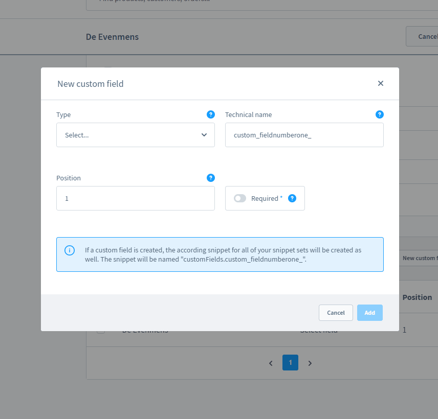
To create a new field in your Shopware 6 custom field set, hit the New custom field button in the area below the General Information section:

Depending on the selected field type, the other settings may change. In the example below, the Select Field type also requires you to specify the field’s technical name, position, whether it is mandatory or not, label, placeholder, and help text.

Choose whether it is a multi-select custom field or not and provide its options.

Save your work. Note that it is possible to add as many custom fields, as you need.
Shopware 6 custom field types
Below, we explore different field types of Shopware 6:
Select
With this custom field type, you can specify different options one or more of which can be selected. Its configurations include:
- Technical name – a unique name of your field used within the system. You can’t change it later.
- Position – a sorting order of the custom field within the set: Lower value displays the custom field at a higher position.
- Required – this toggle lets you define whether a selection is mandatory.
- Label – a user-oriented name displayed in the administration modules.
- Placeholder – text displayed in the dropdown menu when no selection is made.
- Help text – additional information displayed when hovering over a blue question mark symbol.
- Multi-select – a switch to define whether several options can be selected.
- Technical name – a unique technical name;
- Label – a title displayed in the selection list instead of the technical name.
Object selection
This field type lets you refer to other data fields, selecting direct references to existing data fields. Its configurations include:
- Technical name – a unique name of your field used within the system. You can’t change it later.
- Position – a sorting order of the custom field within the set: Lower value displays the custom field at a higher position.
- Required – this toggle lets you define whether a selection is mandatory.
- Label – a user-oriented name displayed in the administration modules.
- Placeholder – text displayed in the dropdown menu when no selection is made.
- Help text – additional information displayed when hovering over a blue question mark symbol.
- Object type – define which data fields you want to refer to.
- Multi-select – a switch to define whether several options can be selected.
Text field
These configurations are available for a text field:
- Technical name – a unique name of your field used within the system. You can’t change it later.
- Position – a sorting order of the custom field within the set: Lower value displays the custom field at a higher position.
- Required – this toggle lets you define whether a selection is mandatory.
- Label – a user-oriented name displayed in the administration modules.
- Placeholder – text displayed in the dropdown menu when no selection is made.
- Help text – additional information displayed when hovering over a blue question mark symbol.
Media
With this field, you can add a media file to frontend pages. The following configurations are associated with this Shopware 6 custom field:
- Technical name – a unique name of your field used within the system. You can’t change it later.
- Position – a sorting order of the custom field within the set: Lower value displays the custom field at a higher position.
- Required – this toggle lets you define whether a selection is mandatory.
- Label – a user-oriented name displayed in the administration modules.
Number
Use this field to enter numbers. Configure it as follows:
- Technical name – a unique name of your field used within the system. You can’t change it later.
- Position – a sorting order of the custom field within the set: Lower value displays the custom field at a higher position.
- Required – this toggle lets you define whether a selection is mandatory.
- Label – a user-oriented name displayed in the administration modules.
- Placeholder – text displayed in the dropdown menu when no selection is made.
- Help text – additional information displayed when hovering over a blue question mark symbol.
- Number type – specify whether the entries are integer or float.
- Steps – define the possible steps.
- Min/Max – specify the smallest/largest possible input.
Date/Time
This field is associates with a selection mask for date and time. Its configuration options include:
- Technical name – a unique name of your field used within the system. You can’t change it later.
- Position – a sorting order of the custom field within the set: Lower value displays the custom field at a higher position.
- Required – this toggle lets you define whether a selection is mandatory.
- Label – a user-oriented name displayed in the administration modules.
- Help text – additional information displayed when hovering over a blue question mark symbol.
Checkbox
Use this custom field to add a checkbox that offers a boolean data set (“0″/”1”) in the background. Configure it as follows:
- Technical name – a unique name of your field used within the system. You can’t change it later.
- Position – a sorting order of the custom field within the set: Lower value displays the custom field at a higher position.
- Required – this toggle lets you define whether a selection is mandatory.
- Label – a user-oriented name displayed in the administration modules.
- Help text – additional information displayed when hovering over a blue question mark symbol.
Active/Inactive switch
A switch that provides the same opportunity: It transfers a boolean data set in the background.
- Technical name – a unique name of your field used within the system. You can’t change it later.
- Position – a sorting order of the custom field within the set: Lower value displays the custom field at a higher position.
- Required – this toggle lets you define whether a selection is mandatory.
- Label – a user-oriented name displayed in the administration modules.
- Help text – additional information displayed when hovering over a blue question mark symbol.
Text Editor
Enter styled text within the editor and include it in templates.
- Technical name – a unique name of your field used within the system. You can’t change it later.
- Position – a sorting order of the custom field within the set: Lower value displays the custom field at a higher position.
- Required – this toggle lets you define whether a selection is mandatory.
- Label – a user-oriented name displayed in the administration modules.
- Placeholder – text displayed in the dropdown menu when no selection is made.
- Help text – additional information displayed when hovering over a blue question mark symbol.
Color picker
This Shopware 6 custom field allows for selecting a color from a color palette. Alternatively, entering the HEX color code is possible.
- Technical name – a unique name of your field used within the system. You can’t change it later.
- Position – a sorting order of the custom field within the set: Lower value displays the custom field at a higher position.
- Required – this toggle lets you define whether a selection is mandatory.
- Label – a user-oriented name displayed in the administration modules.
How to Display Custom Field On The Shopware 6 Storefront
To display the content of a custom field on the storefront, you need to adjust a corresponding template. Below, we explore how to insert it at a product level, revealing the content on the product details page in the description tab. You need to edit the description.html.twig file. Get it under /custom/plugins/YourTheme/src/Resources/views/storefront/page/product-details/. The derivation starts with the following line:
|
{% sw_extends ‘@Storefront/storefront/page/product-detail/description.html.twig’ %} |
Note that the further file content depends on where the additional field should be displayed. We place it below the description text.
Now, you can include the original content of the page_product_detail_description_content_text block.
Use the following code to do that:
|
{% block page_product_detail_description_content_text %} |
Also, you can rely on this snippet:
|
{{ parent() }} |
Use the code below to integrate the custom field:
|
{{ page.product.translated.customFields.technischer_name_customfield}} |
In Shopware 6, it is possible to find the technical name in the settings of the additional field.
Thus, the final result should look as follows:
|
1 2 3 4 5 6 |
{% sw_extends ‘@Storefront/storefront/page/product-detail/description.html.twig’ %} {% block page_product_detail_description_content_text %} {{ parent() }} {{ page.product.translated.customFields.technical_name_customfield }} {% endblock %} |
For further information, check this article: Changing a template in Shopware 6.
How to Import Custom Fields to Shopware 6
Our team lets you simplify and automate various processes associated with data migration to Shopware 6. Contact our support for more details and try our Improved Import & Export Extension for Shopware. You can use it to import any entities to Shopware 6 from any external platform. Please, consult our specialists before using the module for transferring custom field data to your website.


