How do you get your visitors’ attention without totally interrupting or annoying them?
This is the tightrope that ecommerce marketers have to walk, with every new customer.
Doing so is becoming more and more difficult. After all, our customers’ attention spans continue to shrink.
Marketers are constantly scrambling for fresh tactics to put potential customers and new visitors on a clear path to purchase.
But perhaps the best approach to winning customers’ attention requires going back in time.
Let’s rewind to over two decades ago- when marketing wizard Seth Godin coined the term “permission marketing.” The concept is simple enough: rather than being the loudest voice in the room, present your marketing as an exchange for permission. In Godin’s own words:
“Permission doesn’t have to be formal but it has to be obvious.”
Reaching customers today means putting personalized offers front-and-center while also asking for their explicit permission. That’s where ecommerce popups come into play.
And if you’re skeptical about whether popups still work, we totally get it.
Popups are old-school, right? They might seem like the exact opposite of permission marketing.
However, popups remain a staple of ecommerce for a reason. Look no further than the millions of sites that still rely on them. That’s because popups have come a long way in terms of style and sophistication. If this is still your idea of a popup, it’s time to rethink what they’re capable of:


Fast forward to the present day where popups represent the perfect balance of catching visitors’ eyes and asking for their permission to be sold to.
In this guide, we’ll break down why “certain” ecommerce popups are so effective, best practices for using them, Dos and Don’ts and examples of powerful popups from the best ecommerce brands.
What is a Popup, Anyway?
Simply put, a popup is an overlay that stops on-site visitors and displays a secondary offer.
When it comes to ecommerce, popups are typically used to promote discount codes to first-time visitors, encouraging them to opt-in to an email list.
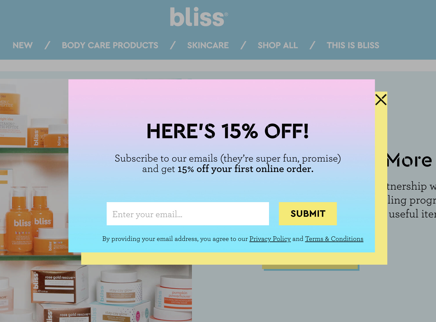

Source
Popups today are also capable of recommending products and content for returning visitors through behavior-based targeting. For example, popups can be triggered based on factors such as how long someone’s spent on a particular page, how much they’ve scrolled through, what pages they visited, or whether they’re a first-time visitor.
One of the most important distinctions between modern popups and spammy ads of the past, is how they’re designed and presented to visitors. Specifically- modal popups that temporarily pause visitors’ screens from scrolling, rather than force an annoying window that can’t easily be clicked away.
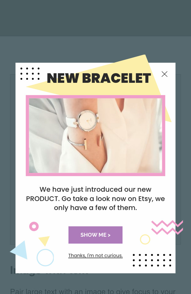
Below is an example of a mobile popup that presents itself as an overlay on a visitors’ screen. It’s scroll-friendly and offers a clear place to opt out if you want to. What’s considered the norm today? This variety of friendly, stylish popups- as seen below:

Why are Popups Important for Ecommerce?
Fair question!
As noted earlier, popups have been a cornerstone of digital advertising for decades now.
However, a boom in ad blocking software and “banner blindness” in recent years has forced popups to change for the better. In short, ecommerce popups can (and should) feel as if they’re a seamless part of your site rather than a disruption.
And this new form of popup represents a major opportunity for ecommerce merchants.
When done right, popups go hand in hand with increased conversion rates, more leads, and greater revenue. Just about every major ecommerce brand has some form of popup strategy present onsite and that’s no coincidence.
Also, consider that popup designs have come a long way. From colorful, eye-popping windows to subtle, minimalist opt-in forms- you can put ads together that are both enjoyable and inviting for visitors.
The beauty of popups is that they can produce immediate results for merchants.
Want to start collecting email addresses from your visitors?
Looking to learn more about how your leads behave?
Popups allow you to do both ASAP.
Modern popup tools also require little legwork and no necessary coding knowledge. From working with templates to integrating popups into your BigCommerce site, getting your ads off the ground can be done as a quick DIY win in a matter of minutes.
How to Use Popups the Right Way
Let’s cut to the chase: the poor reputation of popups is due to so many brands misusing them for years. You can’t just slap popups on your site and expect legit results.
Through intelligence tools and behavior-tracking, popups allow you to connect with your visitors and attract more leads. Like any other marketing campaign or strategy, ecommerce popups need to be fine-tuned and optimized with your customers in mind.
Below are some Key Dos and Don’ts of putting together a nice popup campaign:
- DO promote more than just deals. Discounts codes and coupons might be the bread and butter of brands using popups, but that’s not all they’re capable of. For example, consider using popups to recommend products, share content, and introduce time-sensitive offers.
- DO make your popups feel distinct from the rest of your site. Through style choices such as your design and color scheme, you can win the undivided attention of your visitors while sticking with your existing branding.
- DO present popups that illustrate your brand voice. Effective popups do more than just scream “BUY NOW!” Ideally, your campaigns should concisely highlight your brand’s personality and present a friendly invitation to take the next step.
- DON’T interrupt new visitors before they’ve had a chance to browse. Abrupt pop-ups are jarring and likely won’t leave a positive first impression.
- DON’T present the same popup to every visitor. Instead, personalize for your visitors and create messages for each visitor group (think: first-time visitors, abandoned customers, or repeat buyers).
- DON’T display irrelevant popups or multiple ads for the same visitor in one session. Imagine someone asking you the same question multiple times or egging you on when you’ve told them you’re not interested. That’s exactly what repeat popups feel like, so avoid doing so in your ads.
The takeaway here is that popups should be created with the customer’s experience in mind. Put yourself in your visitors’ shoes and think about the sort of popups that would encourage you to opt-in.
On the flip side, consider the marketing messages that turn you off. You wouldn’t want to feel annoyed or disrupted… your customers probably don’t want to feel that way either. Empathy ensures that your popups reach users in both a thoughtful and welcoming way.
Coming Up with Proper Popup Goals
Goal-setting is key to not only figuring out which kind of popups you want to create but also how you’ll measure their success. Let’s look at some sample goals related to ecommerce popups.
1. Drive more sales.
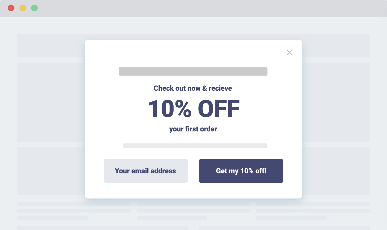
This is the big one. It’s well-documented that shoppers are hesitant to pay full price when buying from a new merchant (this is especially true among younger consumers). A popup discount can provide a push for first-time buyers and repeat customers alike.

Source
2. Grow your list.
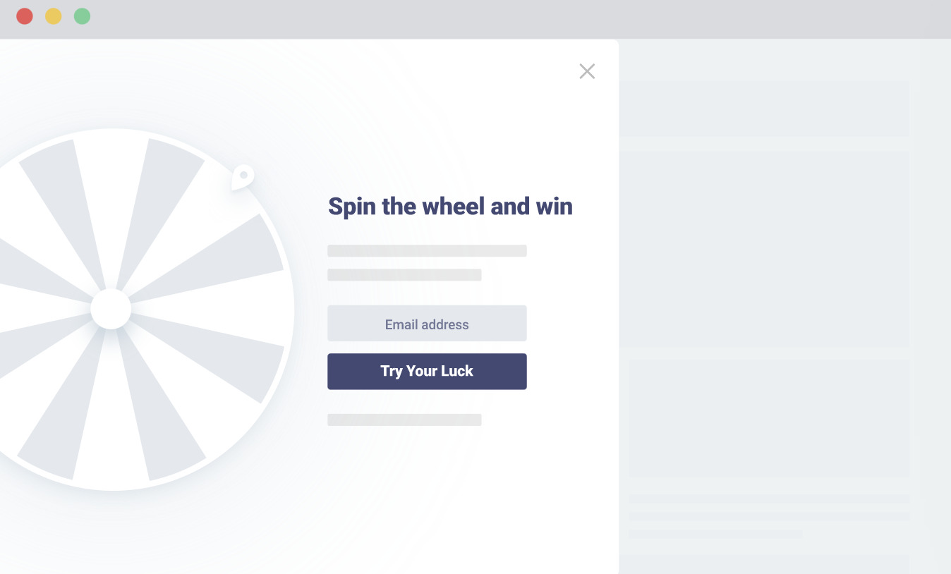
Opt-ins don’t happen by accident: you need to ask for ‘em. If your end-game is to grow your email list or newsletter subscriber count, popups represent a prime opportunity to gather email addresses and loyal fans. Beyond email, popups can help grow your social messenger and SMS lists as well.

Source
3. Generate leads.
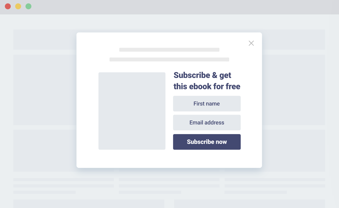
Popups can also boost your form submissions to generate leads to nurture via email marketing. Opt-in pops are particularly powerful for merchants offering lead magnets such as free ebooks or courses, serving as the starting point for your drip campaigns.

Source
4. Improve your customer experience.
If nothing else, popups and their associated analytics can teach you a ton about your target audience.
For example, you can learn which products and pages drive the most opt-ins. You might also notice that certain popups perform better with different types of traffic (social, organic, and so on). The more you learn about the customer experience, the easier it is to optimize it. Popups can help you make sense of your on-site data beyond say, Google Analytics.
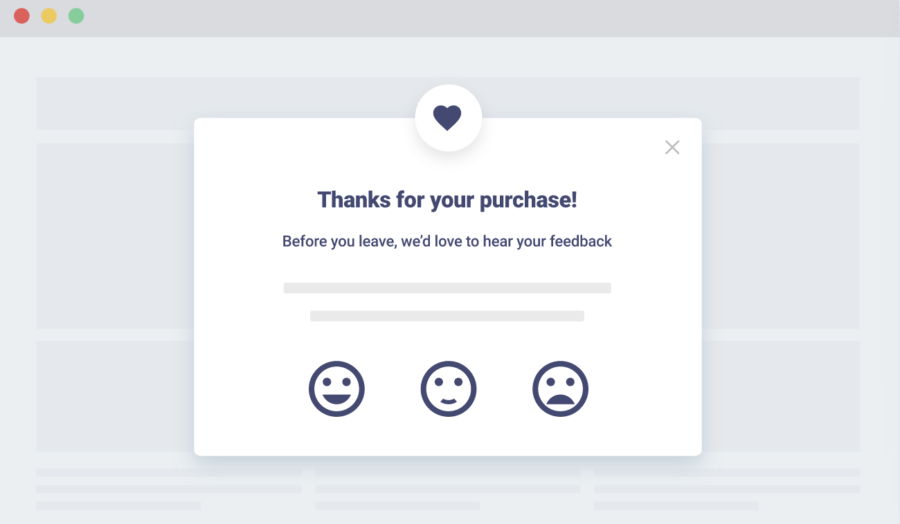
Popups are likewise a valuable source of direct customer feedback. You might use a popup to ask visitors on how they found you, or even hook them up with a product quiz to redirect them to an appropriate page. No matter how you roll them out onsite, you’re constantly learning more and more about your audience.

Source
5 Types of Popups to Win Over Your Target Audience
Now, let’s take a look at the different types of popups available to merchants (and creative examples in action). Any combination of the following ecommerce popups are fair game- depending on your goals.
1. Entry popups.
No surprises here. Entry popups appear when someone lands on your site for the first time.
Here’s an entry popup example from Skullcandy, prompting visitors with a sweet 15% off deal upon signing up for their email list.
Merchants need to be mindful when using entry popups, though. Remember what we said earlier about disrupting first-time visitors before they’ve even had a chance to shop around? Entry pops are typically reserved for bigger brands that have enough name recognition that such ads are seen as a courtesy rather than an interruption.
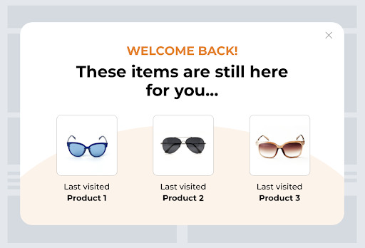
We recommend using entry popups as a method of welcoming returning visitors. For example, you might suggest an offer or recommend products to someone based on what they were browsing last time. This can serve as a sort of “Oh yeah” moment that motivates a purchase.

Source
2. Scroll-based popups.
Scroll-based popups allow you to target visitors who’ve engaged with your content. Someone who takes the time to scroll through a page, has already shown subtle (but significant) interest in what you’re selling.
Applied to category pages or blog posts, scroll-based popups can serve as a reward for visitors who stick around and browse. The fact that these popups are based on engagement, means that they’re more likely to serve relevant shoppers.
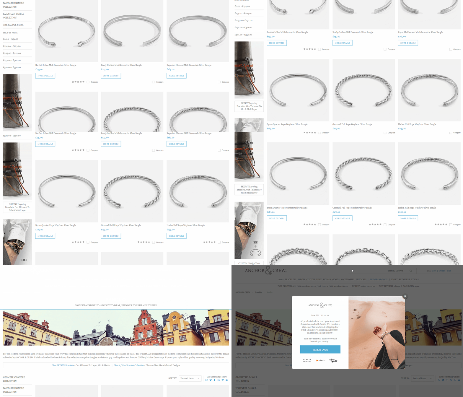
Here’s a popup example from Anchor and Crew, which appears after someone has scrolled through a category page. As an added bonus, the popup’s “reveal code” CTA makes the offer feel more exclusive.

3. Delayed popups.
Delayed popups are displayed after visitors spend a certain amount of time on your website.
The advantages of delayed popups are two-fold. They tend to perform well, as they only target shoppers who are interested enough to stay glued to your site. Meanwhile, they can help encourage inactive or fickle traffic to do something.
For example, you can use a delayed popup to recommend trending or best-selling products. These types of popups serve as a way to legitimately help out visitors rather than just advertising to them.
Make sure you don’t arbitrarily time your delayed popups though- make sure to check your Google Analytics as a frame of reference. There you can detect pages where traffic is spending a long amount of time (and might need assistance) and likewise gauge what would be an optimal time for serving your popup (30 seconds, 60 seconds, and so on).
4. Interaction-based popups.
Interaction-based popups are typically triggered when a visitor clicks a particular button or link on-site. In short, these types of popups are used based on what your visitors show interest in.
They’re ideal for driving registrations (webinars and free trials) or downloads (ebooks or other lead magnets).
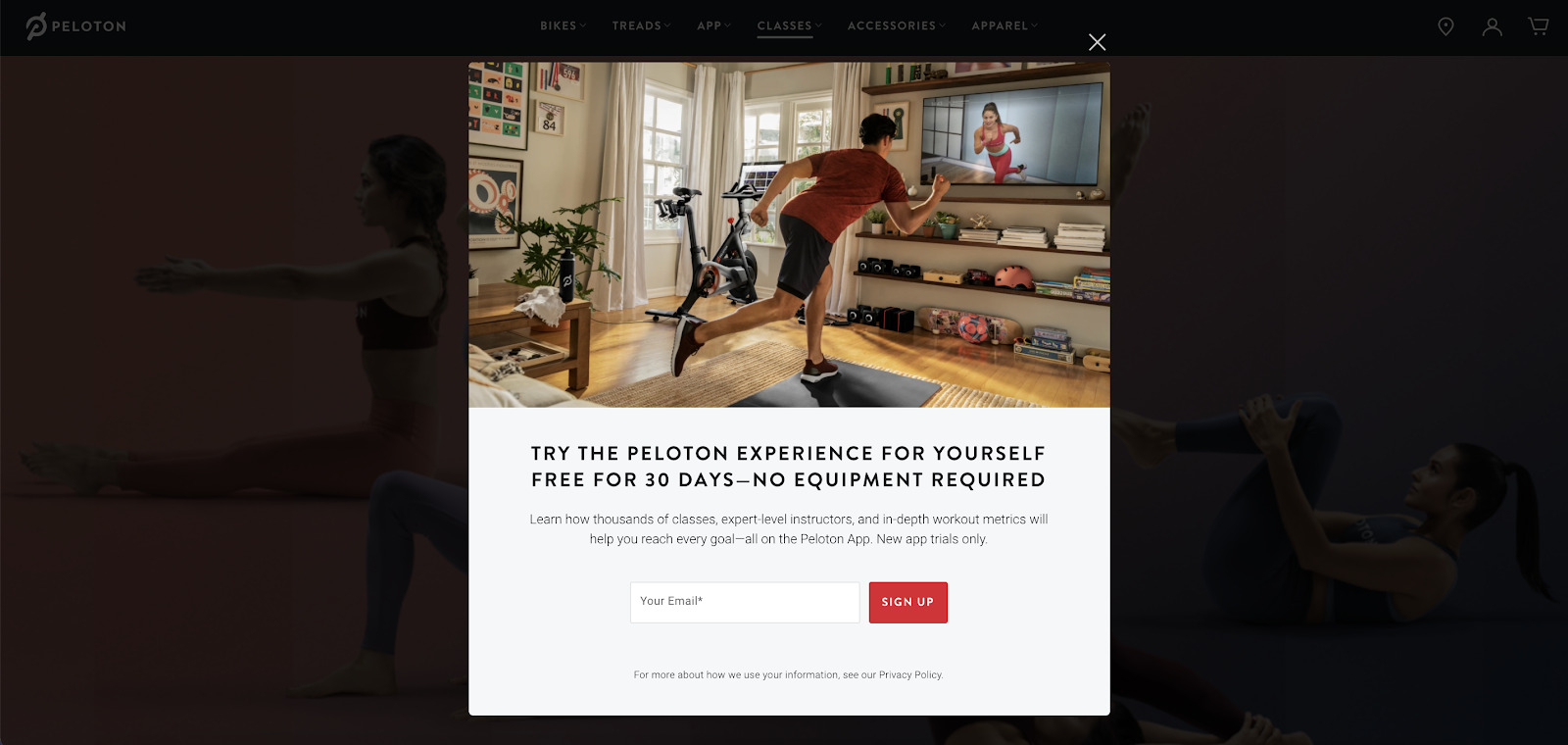
Unlike the other popup types mentioned so far, these are usually a bit wordier as they speak directly to the visitor’s intent. Below is an example of an interaction-based popup from Peloton after browsing their classes page:

5. Exit-intent popups.
Exit-intent popups demand the attention of abandoning visitors at the exact moment a visitor is about to bounce from your site.
These popups are by far the most popular and widely-used. That’s because exit-intent popups are a direct way to battle the phenomenon of cart abandonment.
An exit-intent popup can win back would-be lost sales by sweetening the deal with free shipping or an added bonus discount.
Presentation is a big part of making exit-intent popups work. For example, many brands couple their exit-intent popups with time-sensitive offers to serve as a “now or never” moment for shoppers.
4 Awesome Ecommerce Popup Examples
To wrap things up, let’s look at some top-tier examples of high-performing ecommerce popups. These examples can help serve as motivation for your own popups in terms of creatives and copy.
Example #1: Di Bruno Bros.
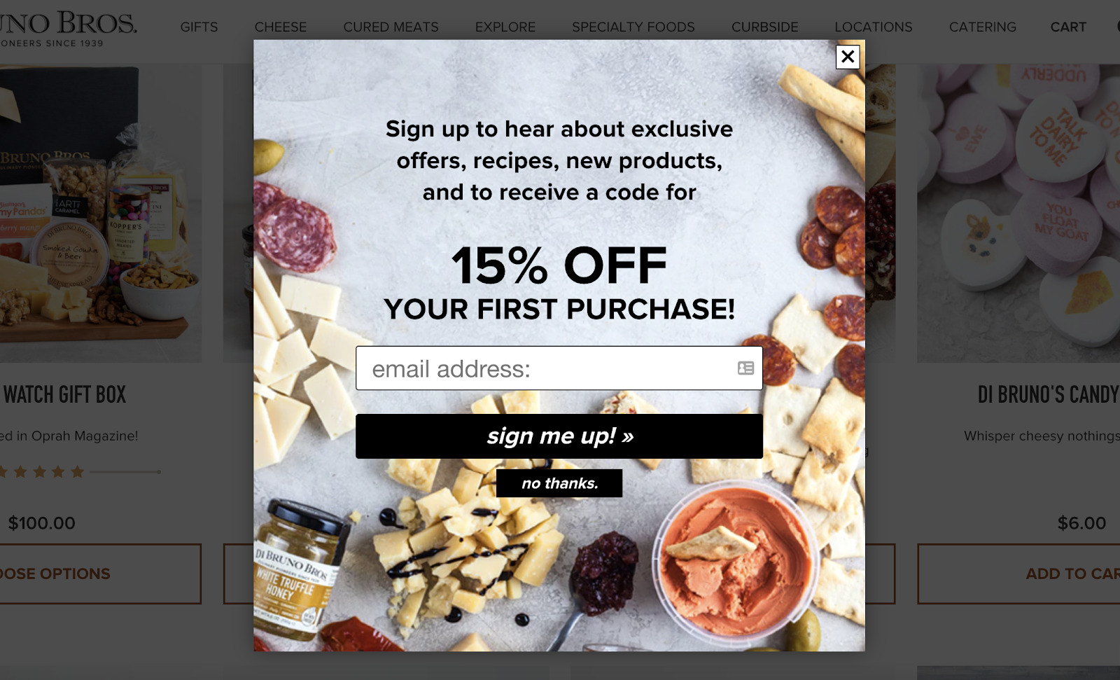
This delayed popup from Di Bruno Bros. is simple but effective- offering a discount in exchange for a newsletter signup.
The colorful design behind the special offer is visually striking, while the “Sign me up!” CTA feels conversational and inviting. This is a shining example of how popups don’t have to be inherently complicated to get the job done.

Example #2: Solo Stove.
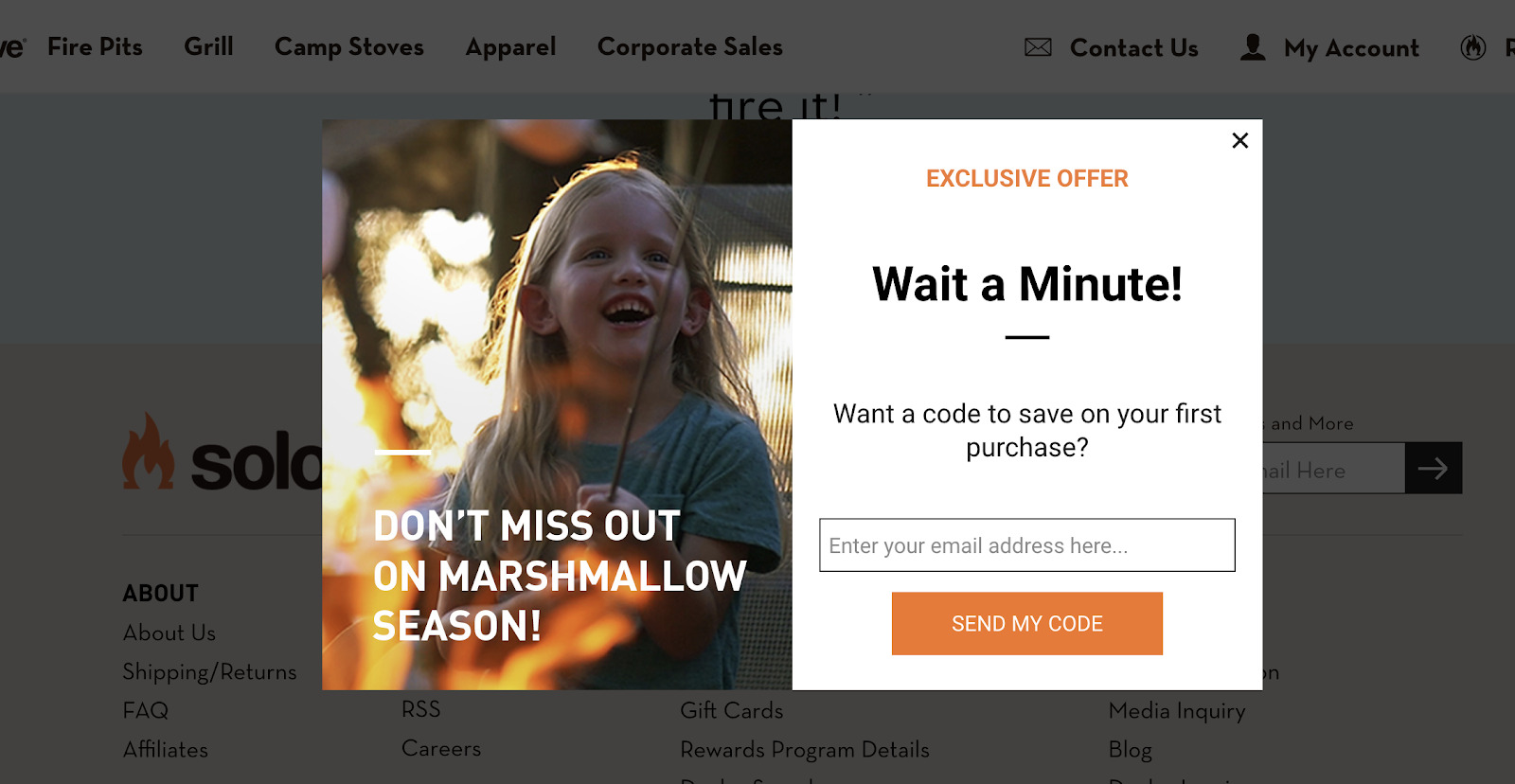
This exit-intent popup from Solo Stove is notable for its attention-grabbing header (“Wait a Minute!”) and creates a sense of excitement.
Showing enthusiasm and hyping up your offers is ideal for reducing abandonment as you make your product seem “can’t-miss”. The popup likewise shows off the brand’s personality and is anything but boring.

Example #3: Natori
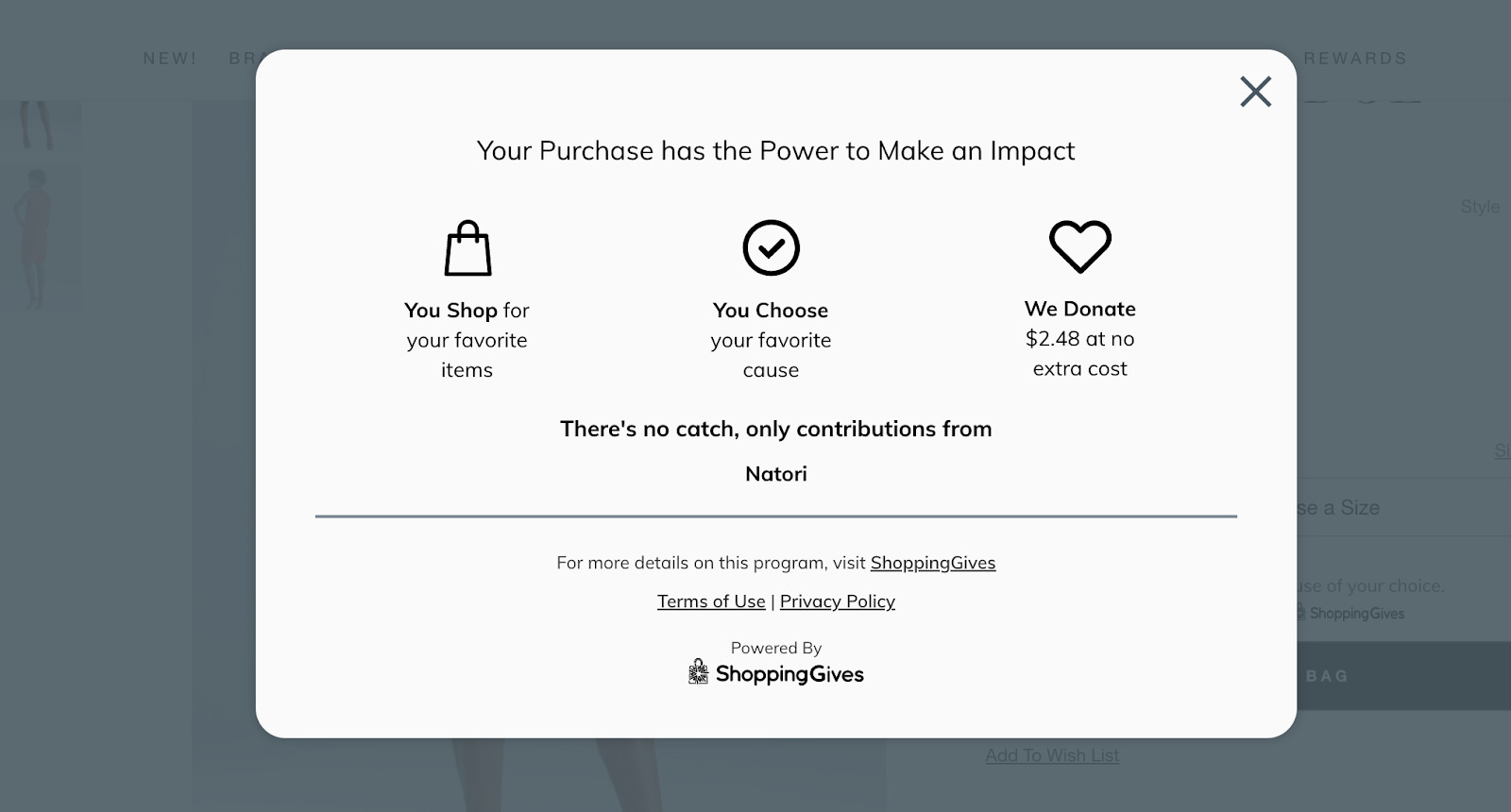
Not all popups require you to sell something. For example, this interaction-based popup from Natori (displayed after clicking a “Learn More” CTA) highlights more information about how the brand’s products support causes- without requiring visitors to leave the product page. This is a great example of how popups can encourage visitors to take action without being too salesy about it.

Example #4: Revelry
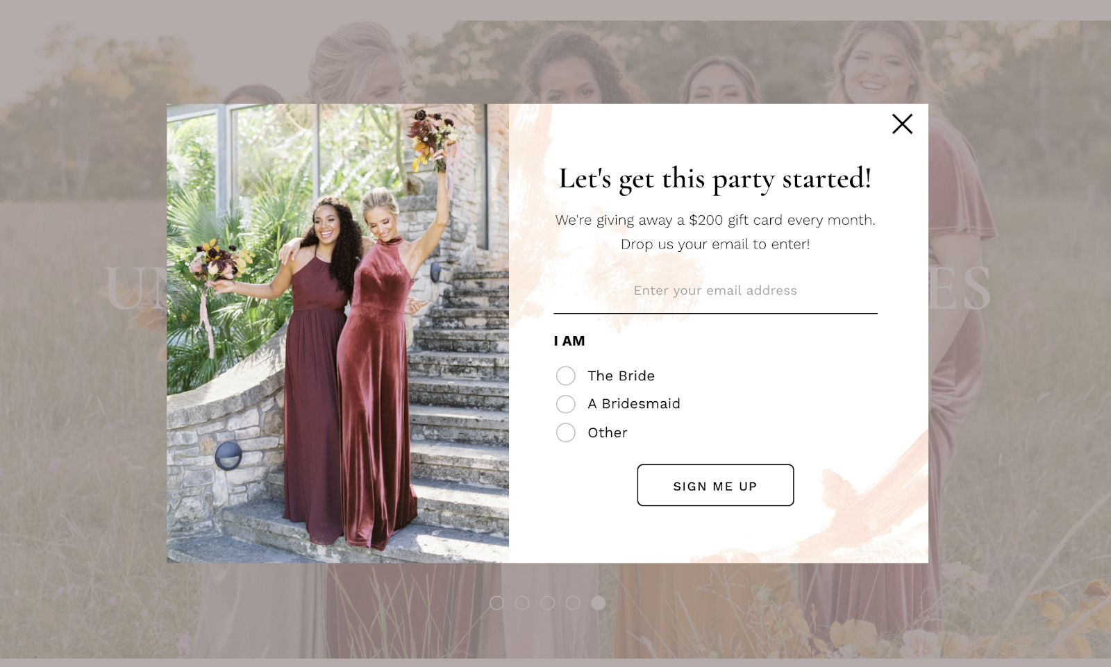
This popup from Reverly showcases how ecommerce popups can be used to segment your list (in this case, brides versus bridesmaids). This information allows for more relevant targeting and awesome future recommendations.
The popup itself is brimming with personality between its headline (“Let’s get this party started!”) and entices opt-ins with a potential $200 prize. Giveaways are a prime way to build your email list and this popup proves it.

Wrapping Up
Listen: ecommerce popups are here to stay.
Although “popup” was once a cringe-worthy term in advertising, the medium has evolved to meet the needs of modern shoppers. Through personalization and targeting, merchants can use popups as a means to not only learn more about their audience but also to create meaningful customer experiences.
And the more popup campaigns you run, the better you can optimize your storefront’s conversion strategy and make serious use of your marketing messages.
The takeaway? Popups represent the perfect balance between asking permission and getting your customers’ precious attention. When done right, they’re the much-needed push that encourages shoppers to take action.


